Total Pageviews
Thursday, September 1, 2011
First Assignment!
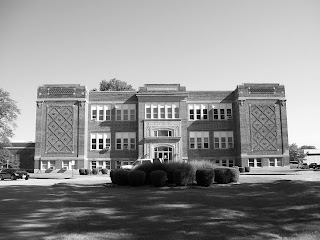
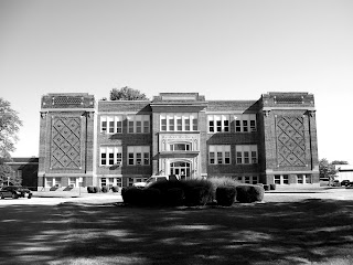
For the first blog assignment, we have been instructed to choose one of the 72 pictures we shot to edit into the best black and white image we could come up with using what we have been taught in the classroom thus far. So, for my photo, I chose one that I took of Campell Hall. I realize now that I could have taken a much better photo. I should have had the camera more level because the edges of the building do not line up with the edges of the photo. Second, I should have stepped waaaay back. I am too close to the building and the bottom of the building is obscured by the landscaping in front of it. Third, I should have got a shot without the vehicles. Just seems like the vehicles make it an everyday shot instead of something more special. With all that said, we have first image in color.
The second photo is desaturated of the color. Thats basicly all I did to that one.
The third photo, I played with the levels of the black, white, and gray until I liked it.
The fourth photo, I cropped it to try and get rid of the extra empty space around the building. I tried to burn some of the landscaping in front of the building as well.
This is the first attempt at editing photos in this way and any and all feedback is appreciated! Thanks!
Subscribe to:
Post Comments (Atom)


I personally prefer the 3rd and 4th with 4th being my top pick. I understand where you are coming from because I considered this shot in our first 36 and didn't attempt it because of the vehicles and judging the distance to get it all in frame well, so kudos for jumping in despite that! (seems there is always a vehicle in the way so its definitely an accurate depiction)
ReplyDeleteI think being able to self critique is great just don't be too harsh on yourself because we always tend to self judge worse than anyone else would and we are all just starting out this learning experience. I say of the ones I have seen everyone has made a great first assignment, but hey I really don't count,keep up the good work though =)
Hey, thanks! Your comment is very encouraging! :D
ReplyDeleteGreat work. My favorite is the third one :)
ReplyDeleteThe shadows that are cast by the low sun are really working well for this image once it's in black & white. I understand what you mean about the vehicles, but for a first attempt excercise, this works pretty well. It is definitely stronger after you played with the levels.
ReplyDeleteI really like the third one, but also agree with Amanda. Don't be so hard on yourself :) the image is good. And maybe we all will get really good with the cloning tool and get rid of those vehicles. If I had to pick, I would choose the third image, as well. This image seems to be working the best in my opinion. I think you did very well on our first attempts, so keep it up :D
ReplyDeleteLike all three but the second is my favorite.
ReplyDelete